Content modeling annotations
An important step of content modeling is defining data interactions—how users and databases interact with the model. This section lists the annotations you can use to implement data interactions.
In addition to the annotations in this section, your model can use annotations defined in the Dari @Recordable interface. Those annotations provide a wide variety of data validation, data processing, and string manipulation functionalities. For details, see Data modeling annotations.
See also:
Clears the placeholder text when an editor starts keying in the annotated field. Requires @Placeholder, @EditablePlaceholder.
The following table lists the elements available with this annotation.
| Element |
Description |
Valid Value |
|---|---|---|
| value |
If true or absent, the placeholder text is cleared.
If false, the placeholder text remains. |
true (default), false |
The following snippet includes an example of applying this annotation.
import com.psddev.cms.db.Content;
import com.psddev.cms.ui.form.ClearOnPlaceholderChange;
import com.psddev.cms.ui.form.EditablePlaceholder;
import com.psddev.cms.ui.form.Placeholder;

public class Article extends Content {

    @Placeholder("Today's headline: ")
    @ClearOnPlaceholderChange(false)
    @EditablePlaceholder(true)
    private String headline;

}-
When an editor starts typing in the field Headline, ensures the placeholder text is not cleared.
Applies to: Class
Excludes or includes instances of this content type from indexing by Solr. Instances excluded from indexing do not appear as search results in the search panel. (If you want to include instances of this content type in Solr indexing but exclude them from the search panel, combine this annotation with @ToolUi.ExcludeFromGlobalSearch.)
The following table lists the elements available with this annotation.
| Element |
Description |
Valid Value |
|---|---|---|
| value |
If true or absent, Brightspot’s search results include items of this content type.
If false, Brightspot’s search results exclude items of this content type. |
true (default), false |
By default, models extending from Content are searchable, and models extending from Record are not searchable.
This annotation is inherited, so models extending from an annotated model have the same setting for @Content.Searchable.
The following snippet includes an example of applying this annotation.
import com.psddev.cms.db.Content;

@Content.Searchable(false)
public class Article extends Content {

}-
Excludes all matching instances of Article from search results.
import com.psddev.cms.db.Content;
import content.article

@Content.Searchable
public class Recipe extends Article {

}-
Sets @Content.Searchable to true, reversing the effect of the inherited annotation. As a result, recipes are included in the search results.
-
Specifies that Recipe extends from Article, which implies that Recipe objects are also excluded from search results as indicated in the previous snippet.
Applies to: Field, Method
Specifies the date ranges in available from a date filter in the search panel. Requires @ToolUi.Filterable.
The following table lists the elements available with this annotation.
| Element |
Description |
Valid Value |
|---|---|---|
| value |
String of group names that are applicable to the date field in the search panel. | Array of strings. The following string constants are available:
If |
The following snippet includes an example of applying this annotation.
@Indexed
@ToolUi.Filterable
@ToolUi.CssClass("is-minimal")
@DateTimeRangeGroups({DateTimeRange.FUTURE_RANGE})
private Date dueDate;-
Lists date ranges in the future.


Applies to: Field, Method
Specifies the class defining a field’s or method’s dynamic behavior in the content edit form.
The following table lists the elements available with this annotation.
| Element |
Description |
Valid Value |
|---|---|---|
| value |
Class used to dynamically render or modify a member in the content edit form. |
Any class that implements DynamicField. |
The following snippets include examples of applying this annotation.
import brightspot.core.person.AuthorableData;
import com.psddev.cms.db.ToolUi;
import com.psddev.cms.ui.form.DynamicField;
import com.psddev.dari.db.ObjectField;
import com.psddev.dari.db.Recordable;

public class ArticleBodyDynamicField implements DynamicField {

    @Override
    public void update(Recordable record, ObjectField field) {
        field.as(ToolUi.class).setReadOnly(record.as(Article.class).getAuthors().isEmpty());
    }
}-
Callback that runs when the content edit form is loaded, with every save, and with every work-in-process save.
-
Checks if the passed record has any authors. If not, the field annotated with this class is rendered as read-only. This line uses the method getAuthors declared in the snippet that follows this one.
import brightspot.core.person.Author;
import com.psddev.cms.db.Content;
import com.psddev.cms.ui.form.DynamicFieldClass;

public class Article extends Content {

    private String headline;

    @DynamicFieldClass(ArticleBodyDynamicField.class)
    private Body body;

    private List<Author> authors;

    public List<Author> getAuthors() {
        return authors;
    }
}-
Applies the annotation from the snippet before this one.
-
Provides a list of authors.
Applies to: Class, Field, Method
Specifies the class providing a dynamic note in the content edit form. You can display a note for a field or for the entire form. You can apply more than one of these annotations to the same item.
The following table lists the elements available with this annotation.
| Element |
Description |
Valid Value |
|---|---|---|
| value |
Class used to construct a note associated with the annotated item. |
Any class that implements DynamicNote. |
The following snippets include examples of applying this annotation.
import com.psddev.cms.ui.form.DynamicNote;
import com.psddev.dari.db.ObjectField;
import com.psddev.dari.db.Recordable;

public class ArticleDynamicNote implements DynamicNote {

    @Override
    public Object get(Recordable record, ObjectField field) {
        Integer numStories = methodReturningNumberStoriesByTag("asteroids");
        return "We already have " + numStories.toString() + " articles about asteroids. Please focus on a different topic.";

    }
}-
Callback that runs when the content edit form is loaded.
import com.psddev.cms.ui.form.DynamicNote;
import com.psddev.dari.db.ObjectField;
import com.psddev.dari.db.Recordable;

public class ArticleHeadlineDynamicNote implements DynamicNote {
    @Override
    public Object get(Recordable record, ObjectField field) {
        Date today = new Date();
        SimpleDateFormat DATE_FORMAT = new SimpleDateFormat("MMMM dd, yyyy");
        String date = DATE_FORMAT.format(today);
        return ("Ensure your facts are correct as of " + date.toString() + ".");
    }
}-
Callback that runs when the content edit form is loaded.
import com.psddev.cms.db.Content;
import com.psddev.cms.ui.form.DynamicNoteClass;

@DynamicNoteClass(ArticleDynamicNote.class)
public class Article extends Content {

    @DynamicNoteClass(ArticleHeadlineDynamicNote.class)
    private String headline;

}

See also:
Applies to: Class, Field, Method
Specifies a method that displays a dynamic note. You can display a note for a field or for the entire content edit form. You can apply more than one of these annotations to the same item.
The following table lists the elements available with this annotation.
| Element |
Description |
Valid Value |
|---|---|---|
| value |
Name of method used to construct a note associated with the annotated item. |
Any valid method name. |
The following snippet includes an example of applying this annotation.
import com.psddev.cms.db.Content;
import com.psddev.cms.ui.form.DynamicNoteMethod;

@DynamicNoteMethod("classNote")
public class Article extends Content {

    @DynamicNoteMethod("headlineNote")
    private String headline;

    private String classNote() {
         Integer numStories = methodReturningNumberStoriesByTag("asteroids");
        return "We already have " + numStories.toString() + " articles about asteroids. Please focus on a different topic.";
    }

    private String headlineNote() {
        Date today = new Date();
        SimpleDateFormat DATE_FORMAT = new SimpleDateFormat("MMMM dd, yyyy");
        String date = DATE_FORMAT.format(today);
        return ("Ensure your facts are correct as of " + date.toString() + ".");

    }
}-
Annotation specifying the classNote method for displaying a note at the top of the content edit form.
-
Annotation specifying the headlineNote method for displaying a note for the Headline field.
-
Method that returns a dynamic string.
-
Method that returns a dynamic string.


See also:
Applies to: Field, Method
Specifies the class providing a field’s or method’s dynamic placeholder text in the content edit form.
The following table lists the elements available with this annotation.
| Element |
Description |
Valid Value |
|---|---|---|
| value |
Class used to construct the placeholder text in the annotated field. |
Any class that implements DynamicPlaceholder. |
The following snippets include examples of applying this annotation.
import com.psddev.cms.ui.form.DynamicPlaceholder;
import com.psddev.dari.db.ObjectField;
import com.psddev.dari.db.Recordable;

public class ArticleHeadlineDynamicPlaceholder implements DynamicPlaceholder {

    @Override
    public String get(Recordable record, ObjectField field) {
        DateFormat dateFormat = new SimpleDateFormat("yyyy/MM/dd");
        Date date = new Date();
        return "Hockey scores as of " + dateFormat.format(date);
    }
}-
Callback that runs when the content edit form is loaded. This method returns a string.
import com.psddev.cms.db.Content;
import com.psddev.cms.ui.form.DynamicPlaceholderClass;

public class Article extends Content {

    @DynamicPlaceholderClass(ArticleHeadlineDynamicPlaceholder.class)
    private String headline;

}-
Applies the annotation from the snippet above.


See also:
Applies to: Field, Method
Specifies a method that displays dynamic placeholder text in a field. You can apply more than one of these annotations to achieve multiple effects.
The following table lists the elements available with this annotation.
| Element |
Description |
Valid Value |
|---|---|---|
| value | Name of method that returns a string appearing in the annotated field. | Any valid method name. |
The following snippet includes an example of applying this annotation.
import com.psddev.cms.db.Content;
import com.psddev.cms.ui.form.DynamicPlaceholderMethod;

public class Article extends Content {

    @DynamicPlaceholderMethod("currentDate")
    private String headline;

    private String currentDate() {
        DateFormat dateFormat = new SimpleDateFormat("yyyy/MM/dd");
        Date date = new Date();
        return "Hockey scores as of " + dateFormat.format(date);
    }
}-
Annotation specifying the currentDate method for populating the placeholder text.
-
Method that returns a dynamic string.


See also:
Applies to: Class
Specifies the class defining a class’s behavior in the content edit form. You can apply more than one of these annotations to achieve multiple effects.
The following table lists the elements available with this annotation.
| Element |
Description |
Valid Value |
|---|---|---|
| value | Class used to dynamically render or modify a class in the content edit form. | Any class that implements DynamicType. |
The following snippets include examples of applying this annotation.
@DynamicTypeClass annotation in a single record that may cause problems with ObjectFields. In these cases, Brightspot recommends adding the following line at the end of the update implementation:type.setFields(type.getFields());
Defining dynamic class behavior
import com.psddev.cms.db.TabDisplayMode;
import com.psddev.cms.db.ToolUi;
import com.psddev.cms.ui.form.DynamicType;
import com.psddev.dari.db.ObjectType;
import com.psddev.dari.db.Recordable;

public class ArticleDynamicType implements DynamicType {

    @Override
    public void update(ObjectType type, Recordable record) {
        if (record.as(Article.class).getAuthors().isEmpty()) {
            type.as(ToolUi.class).setTabDisplayMode(TabDisplayMode.TABS);
        } else {
            type.as(ToolUi.class).setTabDisplayMode(TabDisplayMode.MENU);
        }
    }
}-
Callback that runs when the content edit form is loaded and with every save.
-
Checks if the passed record has any authors. If there are no authors, the content edit form has a hotdog menu with a list of tabs. If there are any authors, the content edit form explicitly displays the tabs. This line uses the method getAuthors declared in the snippet below (Applying a dynamic class annotation).
Applying a dynamic class annotation
import brightspot.core.person.Author;
import com.psddev.cms.db.Content;
import com.psddev.cms.ui.form.DynamicTypeClass;

@DynamicTypeClass(ArticleDynamicType.class)
public class Article extends Content {

    private List<Author> authors;

    public List<Author> getAuthors() {
        return authors;
    }
}-
Applies the annotation from the snippet above.
-
Provides a list of authors.
In the previous video, the tabs display explicitly or under a hotdog menu depending on the existence of any authors.
Places the cursor after a field’s placeholder text. This annotation reduces the number of keystrokes necessary to prepend a standard phrase before a string in a field. Requires @Placeholder. Overrides @ClearOnPlaceholderChange.
The following table lists the elements available with this annotation.
| Element |
Description |
Valid Value |
|---|---|---|
| value | If true or absent, on field focus the cursor is positioned after the placeholder text. If false, on field focus the cursor is positioned before the placeholder text. |
true (default), false |
The following snippet includes an example of applying this annotation.
import com.psddev.cms.db.Content;
import com.psddev.cms.ui.form.EditablePlaceholder;
import com.psddev.cms.ui.form.Placeholder;

public class Article extends Content {

    @Placeholder("Today's headline: ")
    @EditablePlaceholder
    private String headline;

}-
When an editor applies focus to the field Headline, the cursor is positioned after the placeholder text.
In the previous video, the editor clicks in the field Headline, and the cursor is positioned after the placeholder text.
Applies to: Class, Field, Method
Specifies a static note containing HTML markup appearing adjacent to the annotated item. (To render a plain-text note, see @Note.)
The following table lists the elements available with this annotation.
| Element |
Description |
Valid Value |
|---|---|---|
| value | Explanatory text appearing adjacent to the annotated class or field. | Any valid HTML string. |
The following snippet includes an example of applying this annotation.
import com.psddev.cms.db.Content;
import com.psddev.cms.db.ToolUi;
import com.psddev.cms.ui.form.HtmlNote;
import com.psddev.dari.util.StorageItem;

@HtmlNote("<span>Contact <a href=\"mailto:[email protected]\">[email protected]</a> for technical support.</span>")
public class Article extends Content {

    @HtmlNote("<span style=\"font-weight: bold\">Hint</span> Drag files here.")
    @ToolUi.BulkUpload
    private StorageItem image;

}-
Displays a note at the top of the content edit form.
-
Displays a note adjacent to the Image field.


See also:
Applies to: Class, Field, Method
Specifies a static plain-text note appearing adjacent to the annotated item. (To render a note containing HTML, see @HtmlNote.)
The following table lists the elements available with this annotation.
| Element | Description | Valid Value |
|---|---|---|
| value | Explanatory text appearing adjacent to the annotated class or field. | Any string. |
The following snippet includes an example of applying this annotation.
import com.psddev.cms.db.Content;
import com.psddev.cms.db.ToolUi;
import com.psddev.cms.ui.form.Note;
import com.psddev.dari.util.StorageItem;

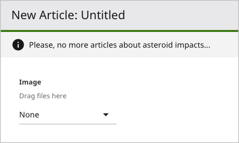
@Note("Please, no more articles about asteroid impacts...")
public class Article extends Content {

    @Note("Drag files here")
    @ToolUi.BulkUpload
    private StorageItem image;

}-
Displays a note at the top of the content edit form.
-
Displays a note adjacent to the Image field.

See also:
Applies to: Field, Method
Specifies static placeholder text appearing in a field. (To render dynamic placeholder text, see @DynamicPlaceholderClass, @DynamicPlaceholderMethod.)
The following table lists the elements available with this annotation.
| Element | Description | Valid Value |
|---|---|---|
| value | Placeholder text appearing in the annotated class or field. | Any string. |
The following snippet includes an example of applying this annotation.
import com.psddev.cms.db.Content;
import com.psddev.cms.ui.form.Placeholder;

public class TestArticle extends Content {

    @Placeholder("Write your headline here.")
    private String headline;

}-
Displays placeholder text in the Headline field.


See also:
Applies to: Class.
Ensures rich-text elements do not have nested markup.
When editors concatenate one rich-text element after another, Brightspot stores those elements as nested.
<div class="h1">
    Massive Rogue Asteroid
    <div class="h2">
        on Course to Destroy
    </div>
    All Life in Van Nuys, CA
</div>-
Child element
<div class="h2">on Course to Destroy</div>is nested within a parent element<div class="h1">Massive Rogue Asteroid All Life in Van Nuys, CA</div>
Depending on the editors’ preferences and the CSS definitions, nesting may not provide predictable or desirable rendering. You can use the annotation @RichTextElement.Exclusive to prevent nesting.
Implementing this annotation requires the following steps.
Step 1: Annotate a marker interface
import com.psddev.cms.db.RichTextElement;
import com.psddev.dari.db.Recordable;

@RichTextElement.Exclusive
public interface ElementsWithoutNesting extends Recordable {
}-
Applies the annotation @RichTextElement.Exclusive to the interface.
-
Declares a marker interface.
Step 2: Implement interface in rich text element
import com.psddev.cms.db.RichTextElement;
import com.psddev.dari.db.Recordable;

@Recordable.DisplayName("Heading 1")
@RichTextElement.Tag(
        value = "h1",
        preview = true,
        block = false)
public class HeadingOneRichTextElement extends RichTextElement implements ElementsWithoutNesting {

    @Required
    private String heading1;

    public String getHeading1() {
        return heading1;
    }

    public void setHeading1(String heading1) {
        this.heading1 = heading1;
    }
}-
Specifies the marker interface you created in Step 1. When editors concatenate an implementing rich-text element after another implementing rich-text element, Brightspot closes the original element and opens the new element. See the following snippet.
The following snippet is the result.
<div class="h1">
    Massive Rogue Asteroid on Course
</div>
<div class="h2">
    to Destroy All Life in Van Nuys, CA
</div>
Applies to: Class
Configures the appearance and behavior of a rich-text element in a rich-text editor.
The following table lists the elements available with this annotation.
| Element | Description | Valid Value |
|---|---|---|
| value | Custom tag surrounding the rich-text element in published HTML. For example, for value="quote", the rich-text element appears inside tags. | Any string valid for an HTML tag. Required. No default. |
| htmlBody | Treats the RichTextElement’s body text as HTML or plain text. The element's value affects the implementation of the RichTextElement’s fromBody method. |
true, false (default). |
| initialBody | Initial content for the rich-text element. | Any string. If blank (default), there is no initial content for rich-text element. |
| block | Places the rich-text element in its own line in the rich-text editor. | true, false (default). When true, inline in the @ToolUi.RichText annotation must be false. See @ToolUi.RichText. |
| preview | Displays a preview of the rich-text element inside the rich-text editor. The preview is generated by overriding RichTextElement#writePreviewHtml. | true, false (default) |
| readOnly | Prevents modification of an existing rich-text element. | true, false (default) |
| root | Indicates rich-text element can contain child elements. | true, false (default) |
| children | List of class instances that can be embedded in instances of this rich-text element. | Array of classes. |
| menu | Toolbar item under which this rich-text element appears. If absent, rich-text element appears directly on the toolbar. | Any string. Default is string of length zero, in which case rich-text element appears on toolbar. |
| tooltip | Displays a tool tip when the mouse hovers over the rich-text element’s menu item. | Any string. If blank (default), no tool tip appears. |
| keymaps | Shortcut keys associated with the rich-text item. The shortcut keys are active while the cursor is inside the edit area. | Array of strings representing keyboard shortcuts, such as {"Ctrl-I","Cmd-I"}. Any string that complies with CodeMirror’s Key Maps is valid. Default is no keyboard shortcut. |
| position | Sort order in which menu items appear compared to other menu items in same level on the toolbar. The sort order is as follows:
|
Double. Default is 0. |
The following snippet includes an example of applying this annotation.
import com.psddev.cms.db.RichTextElement;
import com.psddev.dari.db.Recordable;

@Recordable.DisplayName("Pull Quote")
@RichTextElement.Tag(value = "quote",
    block = true,
    initialBody = "Meaningful quote here",
    menu = "Tools",
    preview = true,
    readOnly = true,
    root = true,
    keymaps = {"Ctrl-I"},
    tooltip = "Add pull quote (Ctrl-I)"
)
public class PullQuoteRichTextElement extends RichTextElement {

}-
Specifies the label of the rich-text element’s menu item.
-
Generates
tags around the rich-text element at run time.
-
Sets the rich-text element in its own line.
-
Specifies the initial text in the rich-text element’s widget.
-
Places menu item under the top-level Tools menu.
-
Maps the keyboard shortcut Ctrl-I to opening the rich-text element’s widget.
-
Displays a tool tip.
Applies to: Field
Displays the rich-text editor with a standard toolbar and additional custom rich-text elements. Requires @ToolUi.RichText.
The following table lists the elements available with this annotation.
| Element | Description | Valid Value |
|---|---|---|
| value | RichTextElement classes appearing along with standard rich-text toolbar. | Array of classes. |
The following snippet includes an example of applying this annotation.
import brightspot.core.tool.SmallRichTextToolbar;
import com.psddev.cms.db.Content;
import com.psddev.cms.db.RichTextElement;
import com.psddev.cms.db.ToolUi;

public class Article extends Content {

    @ToolUi.RichText(inline = false, toolbar = SmallRichTextToolbar.class)
    @RichTextElement.Tags({KlingonRichTextElement.class})
    public String body;

}-
Renders the text field as a rich-text editor with a standard toolbar. The element inline = false is mandatory.
-
Adds a custom rich-text element to the toolbar.
Applies to: Class
Specifies the fields used to populate the Description field under SEO in the content edit form. Requires the clause implements Seo.
The following table lists the elements available with this annotation.
| Element | Description | Valid Value |
|---|---|---|
| value | Array of fields whose values are included in the Description field. Brightspot uses only the first element in the array to construct the description. | Array of strings. |
The following snippet includes an example of applying this annotation.
import com.psddev.cms.db.Content;
import com.psddev.cms.db.Seo;

@Seo.DescriptionFields({"headline"})
public class Article extends Content implements Seo {

    private String headline;

}-
Specifies using the value of the model’s headline field as the value for the SEO tab’s Description field.
If editors manually change the value in the Description field, Brightspot disables the automatic copying between the two fields.
You can access the value of the field referred to in the annotation by calling the findDescription() method.
String seoDescription =
model.as(Seo.ObjectModification.class).findDescription();
Front-end developers can use seoDescription to populate the
tag at runtime, as in the following example.
<meta property="description" content="Squashed by Earth's Gravity, Aliens Demand Submission">
Applies to: Class
Specifies from which fields to collect keywords. Requires the clause implements Seo.
The following table lists the elements available with this annotation.
| Element | Description | Valid Value |
|---|---|---|
| value | Array of fields whose values are included in the keywords. | Array of strings. |
The following snippet includes an example of applying this annotation.
import com.psddev.cms.db.Content;
import com.psddev.cms.db.Seo;

@Seo.KeywordsFields({"headline"})
public class Article extends Content {

    private String headline;

}-
Includes the value of the model’s headline field as a source for keywords.
You can access the value of the field referred to in the annotation, along with any other keywords the editor enters under SEO in the Keywords field, by calling the findKeywords() method.
Set<String> seoKeywords =
model.as(Seo.ObjectModification.class).findKeywords();
Front-end developers can use seoKeywords to populate the
tag at runtime, as in the following example.
<meta name="keywords" content="olive onion garlic pineapple pepperoni anchovy mushroom" />
Applies to: Class
Specifies the type of object in the item’s Open Graph tag. Requires the clause implements Seo.
This annotation typically requires additional logic to populate the tag’s content attribute.
The following table lists the elements available with this annotation.
| Element | Description | Valid Value |
|---|---|---|
| value | String specifying the value of the Open Graph property attribute. | String. |
The following snippet includes an example of applying this annotation.
import com.psddev.cms.db.Content;
import com.psddev.cms.db.Seo;

@Seo.OpenGraphType("title")
public class Article extends Content {

    private String headline;

}-
Specifies the Open Graph type is title.
You can access the value of the field referred to in the annotation by calling the getOpen GraphType() method.
String seoOpenGraphType = model.getState().getType().as(Seo.TypeModification.class).getOpenGraphType();Front-end developers can use seoOpenGraphType to populate the
tag at runtime, as in the following example.
<meta property="og:title" content="Squashed by Earth's Gravity, Aliens Demand Submission" />
Applies to: Class
Specifies the fields used to populate the Title field under SEO. Requires the clause implements Seo.
If this annotation is absent, Brightspot places into the <title> tag the item's ID.
The following table lists the elements available with this annotation.
| Element | Description | Valid Value |
|---|---|---|
| value | Array of fields included in the <title> tag. Brightspot uses only the first element in the array to construct the title. |
Array of strings. |
The following snippet includes an example of applying this annotation.
import com.psddev.cms.db.Content;
import com.psddev.cms.db.Seo;

@Seo.TitleFields({"headline"})
public class Article extends Content {

    private String headline;

}-
Specifies using the value of the model’s
<headline>field as the value for the SEO tab’s Title field.
If editors manually change the value in the Title field, Brightspot disables the automatic copying between the two fields.
You can access the value of the field referred to in the annotation by calling the findTitle() method.
String titleString = model.as(Seo.ObjectModification.class).findTitle();Front-end developers can use seoTitle to populate the <meta>tag at runtime, as in the following example.
<meta property="title" content="Squashed by Earth's Gravity, Aliens Demand Submission"</meta>
Applies to: Field
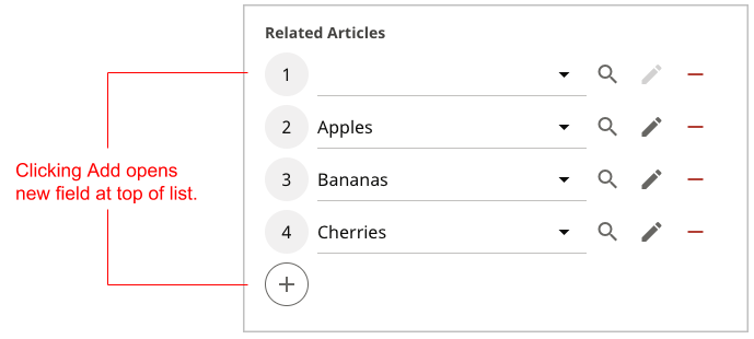
Places new entries at the top of a list’s selection field; without this annotation, new entries appear at the bottom of the selection field. (Applies only to fields of type List; does not apply to fields of type Set.)
The following table lists the elements available with this annotation.
| Element | Description | Valid Value |
|---|---|---|
| value | Indicates new elements appear at top of selection field. | true (default), false |
The following snippet includes an example of applying this annotation.
import com.psddev.cms.db.Content;
import com.psddev.cms.db.ToolUi;

public class Article extends Content  {

    @ToolUi.AddToTop
    private List<Article> relatedArticles;

}-
Opens entries in the selection field on top of the existing entries.
-
Renders a selection field for selecting items of type Article.

Applies to: Field
Indicates the field is available for bulk uploading so that users can drag and drop files from their desktops onto the field. Applies to StorageItem and derived fields in a child model, and requires annotating the child model with @Recordable.PreviewField.
The following table lists the elements available with this annotation.
| Element | Description | Valid Value |
|---|---|---|
| value | Indicates field is available for bulk uploads. | true (default), false |
Implementing bulk upload requires two models: the child model containing the bulk-upload field, and the parent model containing the child model.
import com.psddev.cms.db.Content;
import com.psddev.cms.db.ToolUi;
import com.psddev.dari.db.Recordable;
import com.psddev.dari.util.StorageItem;

@Recordable.PreviewField("image")
public class Image extends Content  {

    private String caption;

    @ToolUi.BulkUpload
    private StorageItem image;

}-
Indicates which of the model’s fields is the preview field. This annotation is required for bulk uploading.
-
Indicates users can drag and drop files from their desktops onto the field Image in the content edit form.
In a production environment, you should limit the types of files users can upload, either globally or at the field level. For details, see Limiting uploads by file type and @Recordable.MimeTypes.
import com.psddev.cms.db.Content;
import java.util.List;

public class Gallery extends Content  {

    private String headline;

    private List<Image> image;

}-
Establishes the field image as a list of Images—the same field annotated with @ToolUi.BulkUpload above.
At run time, Brightspot indicates the field Image is available for bulk upload by displaying the following labels:
- Upload Files—indicating users can drag and drop multiple files from the desktop.
- —indicating users can select a file existing in Brightspot.


After users drag and drop the files onto the field, Brightspot displays a preview of the dragged images along with the content edit form corresponding to the child model.


In the previous image—
- The bulk-uploaded images are part of the Image model.
- As a result, Brightspot displays a preview of the dragged image using the field image.
- Brightspot also displays the content edit form for the model Image.
Applies to: Field
Groups fields under an accordion for presentation on the content edit form. You can use this annotation to provide explanatory information or as a label for closely related fields. Fields without a cluster label appear first in the content edit form before fields with a cluster label. Cluster labels are sorted in order of appearance; you can override this order using the annotation @ToolUi.ClusterDisplayOrder.
The following table lists the elements available with this annotation.
| Element | Description | Valid Value |
|---|---|---|
| value | Cluster label under which this field appears in the content edit form. | Any string. |
The following snippet includes an example of applying this annotation.
import com.psddev.cms.db.Content;
import com.psddev.cms.db.ToolUi;

public class Article extends Content  {

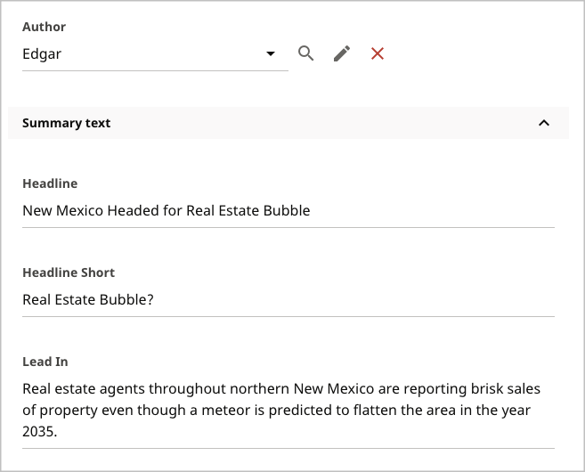
    @ToolUi.Cluster("Summary text")
    private String headline;

    @ToolUi.Cluster("Summary text")
    private String headlineShort;

    @ToolUi.Cluster("Summary text")
    private String leadIn;

    private Author author;
}-
Specifies a cluster heading Summary text as an accordion for the fields headline, headlineShort, and leadIn.
-
Because the field author has no cluster heading, it appears first in the content edit form.

Applies to: Class
Specifies the order in which clusters appear in the content edit form.
By default, Brightspot displays clusters (the accordions you declare with @ToolUi.Cluster) in the order in which they first appear in the model. Using this annotation, you can specify which cluster appears first, which cluster appears last, and if the clusters are sorted alphabetically. Regardless of this annotation, Brightspot always places fields without any cluster at the top of the content edit form.
The following table lists the elements available with this annotation.
| Element | Description | Valid Value |
|---|---|---|
| tab | Tab to which this cluster order applies. | Main or any string appearing as a parameter to the annotation @ToolUi.Tab. Required. |
| alphabetize | If true, clusters are sorted alphabetically.
If false or absent, clusters are sorted in order of first appearance in the model. |
true, false (default) |
| start | Topmost clusters in the content edit form (after fields not associated with any cluster). Brightspot displays the clusters in the order as they appear in the array, so start={"Soda Pop","Mineral Water"} displays the cluster Soda Pop above the cluster Mineral Water. | Array of strings, the elements of which are parameters to the annotation @ToolUi.Cluster. |
| end | Bottommost clusters in the content edit form. Brightspot displays the clusters in the order as they appear in the array, so start={"Soda Pop","Mineral Water"} displays the cluster Soda Pop above the cluster Mineral Water. Overrides alphabetize = true. If the same cluster is passed to start and end, the layout specified by end has higher priority. |
Array of strings, the elements of which are parameters to the annotation @ToolUi.Cluster. |
The following snippet includes an example of implementing this annotation.
import com.psddev.cms.db.Content;
import com.psddev.cms.db.ToolUi;

@ToolUi.ClusterDisplayOrder(tab="Main",alphabetize=true)
public class Article extends Content {

    private String headline;
    private String body;
    private String author;

    @ToolUi.Cluster("Markets")
    private String state;

    @ToolUi.Cluster("Markets")
    private String county;

    @ToolUi.Cluster("Markets")
    private String city;

    @ToolUi.Cluster("Demographics")
    private String gender;

    @ToolUi.Cluster("Demographics")
    private String age;

    @ToolUi.Cluster("Demographics")
    private String occupation;

}-
Specifies that the clusters are sorted alphabetically such that Demographics appears first, overriding the default that Markets be the topmost cluster.
-
Defines three fields without a @ToolUi.Cluster annotation; these fields appear first in the content edit form.
-
Defines three fields appearing under the cluster Markets. By default, Markets is the topmost cluster because it is appears first in the model.
-
Defines three fields appearing under the cluster Demographics.
Containing annotation for @ToolUi.ClusterDisplayOrder annotations. You do not use this annotation explicitly; it implicitly allows for applying multiple @ToolUi.ClusterDisplayOrder annotations to the same model and avoiding a Duplicate annotation error.
import com.psddev.cms.db.Content;
import com.psddev.cms.db.ToolUi;

@ToolUi.ClusterDisplayOrder(tab="Main",alphabetize=true)
@ToolUi.ClusterDisplayOrder(tab="Marketing",alphabetize=true)
@ToolUi.ClusterDisplayOrder(tab="Sales History",start="First Contact Info", end="Latest Contact Info")
public class Article extends Content {

    /* Fields with annotations @ToolUi.Tab and @ToolUi.Cluster. */

}-
Applies the annotation @ToolUi.ClusterDisplayOrder multiple times to the same model.
Applies to: Field
Applies syntax highlighting to the text inside a String field.
The following table lists the elements available with this annotation.
| Element | Description | Valid Value |
|---|---|---|
| value | A code used to apply syntax highlighting. | One of the CodeMirror language modes. |
Language modes for syntax highlighting
| Language Mode | Example on CodeMirror |
|---|---|
| text/clike | C-like mode |
| text/xml | XML mode |
| text/javascript | JavaScript mode |
| text/css | CSS mode |
| text/html | XML mode |
| text/htmlembedded | Html Embedded Scripts mode |
The following snippet includes an example of implementing this annotation.
import com.psddev.cms.db.Content;
import com.psddev.cms.db.ToolUi;

public class Article extends Content  {

    @ToolUi.CodeType("text/xml")
    private String xmlText;

}-
Applies XML syntax highlighting to text in the field xmlText.


Applies to: Field
Displays a progress bar for each item in an embedded list. You can use the progress bar to indicate a particular state of each item in the list, such as the number of times the item was viewed as a percentage of a goal. Applies to a field of type double inside a child model.
The following table lists the elements available with this annotation.
| Element | Description | Valid Value |
|---|---|---|
| value | Indicates Brightspot renders annotated field with progress bar and label. | true (default), false |
Implementing progress bars requires two models: the child model containing the field with the progress bar, and a parent model containing the embedded child model.
import com.psddev.cms.db.Content;
import com.psddev.cms.db.ToolUi;

public class HeadlineProgress extends Content {

    private String headline;

    @ToolUi.CollectionItemProgress
    private double progressBar;

    public void setProgressBar(double progressBar) {
        this.progressBar = progressBar;
    }

    @Override
    protected void beforeSave() {
        setProgressBar(0.5d);
    }

}-
Displays a progress bar in the content edit form for the current object.
-
Updates the value of the progress bar at the
beforeSaveevent. In a typical scenario, you write a function that provides a descriptive state of the object as a percentage, such as number of views as a percent of a goal.
import com.psddev.cms.db.Content;

public class ArticleWithHeadlineProgress extends Content {

    private String category;

    @Embedded
    private List<HeadlineProgress> headlines;

}-
Embeds the child model. This annotation is required to display progress bars.
-
Declares a List of the child model.
At run time, when an editor saves the parent model, the child model’s callback beforeSave updates the percentages, and Brightspot displays the progress bar accordingly.


See also:
Applies to: Field
Displays a toggle for each item in an embedded list. Applies to a field of type boolean inside a child model. Requires @ToolUi.CollectionItemWeight.
The following table lists the elements available with this annotation.
| Element |
Description |
Valid Value |
|---|---|---|
| value | Indicates toggle appears with annotated field. |
When |
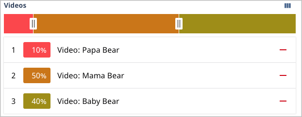
The following table shows the effect of toggling off Headline B in a weighting.
| Headline | Toggle On | Toggle Off |
|---|---|---|
| A | 10 | 20 |
| B | 50 | 0 |
| C | 40 | 80 |
Referring to the previous table, Headlines A and C have relative weights of 20% (10 ÷ 50) and 80% (40 ÷ 50). When Headline B is toggled off, its weight of 50 is allocated 10 points (0.2 × 50) to Headline A and 40 points (0.8 × 50) to Headline C. Developers can access these weights for their own implementations. For example, if three headlines have weights 20%, 50%, and 30%, you can write code to inject the different headlines into parent models 20%, 50%, and 30% of the time.
Implementing item toggles requires two models: the child model containing the toggled field, and a parent model containing the embedded child model.
import com.psddev.cms.db.Content;
import com.psddev.cms.db.ToolUi;
import com.psddev.dari.util.StorageItem;

public class VideoWithToggles extends Content {

    private String title;

    private StorageItem video;

    @ToolUi.CollectionItemWeight(calculated = false)
    private double weight;

    @ToolUi.CollectionItemToggle(value = false)
    private boolean onff;

}-
Displays a weight in the item bar for the current object.
-
Displays a toggle for the current object. You can use these toggles to preview the impact on percentage weights when deleting an item.
import com.psddev.cms.db.Content;

public class PlayListWithItemToggle extends Content {

    private String title;

    @Embedded
    private List<VideoWithToggles> videos;

}-
Embeds the child model. This annotation is required to display toggles.
-
Declares the field
videosas a List of the child model.
At run time, when an editor toggles an item in the list, Brightspot computes the remaining items’ percentages accordingly.
  Item weights with all items toggled on
|
  Item weights with one item toggled off
|
Displays an item bar containing one weight for each item in an embedded list. Optionally displays handles on the item bar to adjust the relative weights of each item. Applies to a double field inside a child model.
The following table lists the elements available with this annotation.
| Element | Description | Valid Value |
|---|---|---|
| value | Activates this annotation | true (default), false |
| calculated | If
If |
true, false (default) |
Implementing item weights requires two models: the child model containing the weighted field, and a parent model containing the embedded child model.
import com.psddev.cms.db.ToolUi;
import com.psddev.dari.db.Record;

public class Headline extends Record {

    private String headline;

    @ToolUi.CollectionItemWeight(calculated = false)
    private double weight;

}-
Displays an item bar with handles.
import com.psddev.cms.db.Content;

public class ArticleWithHeadlineWeights extends Content {

    private String title;

    @Embedded
    private List<Headline> headlines;

}-
Embeds the child model. This annotation is required to display weights.
-
Declares the field
headlinesas a List of the child model.


Applies to: Field
Assigns a single color to all weights inside an item bar. Without this annotation, Brightspot assigns colors to weights that optimize contrast as illustrated in "Item weights with handles and colors." Requires @ToolUi.CollectionItemWeight. Applies to a String field inside a model that extends from Record.
The following table lists the elements available with this annotation.
| Element |
Description |
Valid Value |
|---|---|---|
| value | Color applied to fields annotated with @ToolUi.CollectionItemWeight. |
String representation of a hexadecimal triplet. |
The following snippet includes an example of implementing this annotation.
import com.psddev.cms.db.ToolUi;
import com.psddev.dari.db.Record;

public class Headline extends Record  {

    @ToolUi.CollectionItemWeight(calculated = true)
    private double weight;

    @ToolUi.CollectionItemWeightColor
    private String weightColor = "#007D7D";

}-
Sets the color for all weights to
#007D7D(close to teal).


Applies to: Field
Displays markers at specified points along a weight in an item bar. You can use the markers to indicate when certain events occur, such as when the visitor sees a cue for companion content during a video playback. Requires @ToolUi.CollectionItemWeight. Applies to a List<double> field inside a child model.
The following table lists the elements available with this annotation.
| Element | Description | Valid Value |
|---|---|---|
| value | Indicates Brightspot applies weight markers to annotated field. | true (default), false |
Implementing weight markers requires two models: the child model containing the marked field, and a parent model containing the embedded child model.
Item weight markers—child model
import com.psddev.cms.db.Content;
import com.psddev.cms.db.ToolUi;
import com.psddev.dari.util.StorageItem;

public class VideoWithMarkers extends Content {

    private String title;

    private StorageItem video;

    @ToolUi.CollectionItemWeightMarker
    private List<Double> markers;

    @ToolUi.CollectionItemWeight(calculated = true)
    private double weight;

    public List<Double> getMarkers() {
        if (markers == null) {
            markers = new ArrayList<>();
        }
        return markers;
    }

    @Override
    protected void beforeSave() {
        getMarkers().addAll(Arrays.asList(0.25d, 0.50d, 0.75d));
    }
}-
Indicates the List of markers appears as dots inside the item bar. Each element inside the List represents a decimal percentage from 0.0 to 1.0.
-
Displays the weight for the current item in the item bar.
-
Provides a non-null getter for the list of markers.
-
Adds markers at 25%, 50%, and 75% of the width of the item’s weight at the
beforeSaveevent.
Item weight markers—parent model
import com.psddev.cms.db.Content;

public class PlayListWithWeights extends Content {

    private String title;

    @Embedded
    private List<VideoWithMarkers> videos;

}-
Embeds the child model. This annotation is required to display markers.
-
Declares the field
videosas a List of the child model declared in Item weight markers—child model.
At run time, when an editor saves the parent model, the child model’s callback beforeSave updates the markers, and Brightspot displays the markers accordingly.


In the previous image, the markers appear at 25%, 50%, and 75% of the width of each item’s weight.
Applies to: Field
Renders a String field as a color picker. When a user selects a color from the color picker, Brightspot inserts the corresponding hexadecimal value into the field.
The following table lists the elements available with this annotation.
| Element | Description | Valid Value |
|---|---|---|
| value | Indicates Brightspot renders the annotated field as a color picker. | true (default), false |
The following snippet includes an example of implementing this annotation.
import com.psddev.cms.db.Content;
import com.psddev.cms.db.ToolUi;

public class Article extends Content  {

    @ToolUi.ColorPicker
    private String hexColor;

}-
Renders the field
hexColoras a color picker.


Applies to: Class
Lists the models into which the annotated model can be transformed.
The following table lists the elements available with this annotation.
| Element | Description | Valid Value |
|---|---|---|
| value | Content types into which the annotated class can be transformed. | Array of superclasses from which the annotated class is derived. |
The following snippet includes an example of implementing this annotation.
import com.psddev.cms.db.Content;
import com.psddev.cms.db.ToolUi;

@ToolUi.CompatibleTypes({LongArticle.class,ReallyLongArticle.class})
public class Article extends Content  {

}-
Indicates that
Articlemodels can be transformed toLongArticleandReallyLongArticlemodels.
Applies to: Field, Class
Renders objects on the content edit form using the provided CSS class. When applied to a field, Brightspot renders the field using the provided CSS class; when applied to a class, Brightspot renders the class’s entire content edit form using the provided CSS class.
The following table lists the elements available with this annotation.
| Element | Description | Valid Value |
|---|---|---|
| value | CSS class with which annotated class or field is rendered. | String representing a CSS class. |
The following snippet includes an example of applying this annotation.
import com.psddev.cms.db.Content;
import com.psddev.cms.db.ToolUi;

public class Article extends Content  {

    @ToolUi.CssClass("text-green")
    private String headline;

    private String subHeadline;

}-
Renders the field
headlinein the content edit form using the CSS class text-green. -
Renders the field
subHeadlinein the content edit form using the default styling.


Other supported CSS Class Values:
- Is-minimal can be used to fit as many inputs into a single line as there is space available
- Is-half can be used to place two fields side by side in a row, with each occupying half of the width
- Is-third can be used to place three fields side by side in a row, with each occupying a third of the row’s width
- Is-quarter can be used to place four fields side by side in a row, with each occupying a quarter of the row’s width
Applies to: Field
Displays the field in search results when filtering on the current model.
The following table lists the elements available with this annotation.
| Element | Description | Valid Value |
|---|---|---|
| value | Indicates annotated field appears in search results. | true (default), false |
The following snippet includes an example of applying this annotation.
import com.psddev.cms.db.Content;
import com.psddev.cms.db.ToolUi;

public class Article extends Content  {

    @ToolUi.DefaultSearchResult
    private Author author;

}-
Ensures that when an editor filters search results by Article, the results include a column for
author.
Applies to: Class
Sets the field by which search results are initially sorted when filtering on the current model. Requires the field have the @Indexed annotation. For example, when an editor filters search results by Article, you can set the initial sort field for the results to author.
The following table lists the elements available with this annotation.
| Element |
Description | Valid Value |
|---|---|---|
| value | Sort field by which search results are displayed. | String representing one of the model’s fields. |
The following snippet includes an example of applying this annotation.
import com.psddev.cms.db.Content;
import com.psddev.cms.db.ToolUi;

@ToolUi.DefaultSortField("author")
public class Article extends Content  {

    @Indexed
    private String author;

}-
Indicates that when users filter on Articles in the search panel, the initial sort is by the
authorfield. -
Indexes the author field. This annotation is required to sort the field.


Applies to: Field
By default, Brightspot displays fields in the content edit form in the order they appear in your model. This annotation overrides that sequence, and specifies the order of fields after which the annotated field appears.
See also @ToolUi.FieldDisplayOrder.
The following table lists the elements available with this annotation.
| Element | Description | Valid Value |
|---|---|---|
| value | Fields after which annotated field appears. | Array of strings representing one or more of the model’s other fields. |
The following snippet includes an example of applying this annotation.
import com.psddev.cms.db.Content;
import com.psddev.cms.db.ToolUi;

public class Article extends Content  {

    private String headline;
    private String body;

    @ToolUi.DisplayAfter({"lastName","body"})
    private String firstName;

    private String lastName;
    private String middleName;

}
In the previous snippet, the default order of fields in the content edit form is headline, body, firstName, lastName, and middleName. The annotation @ToolUi.DisplayAfter overrides that order, and places the fields lastName and body (in that order) after firstName.
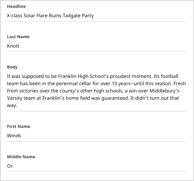

Applies to: Field
By default, Brightspot displays fields in the content edit form in the order they appear in your model. This annotation overrides that sequence, and specifies the order of fields before the annotated field.
See also @ToolUi.FieldDisplayOrder.
The following table lists the elements available with this annotation.
| Element | Description | Valid Value |
|---|---|---|
| value | Fields appearing before the annotated field. | Array of strings representing one or more of the model’s other fields. |
The following snippet includes an example of applying this annotation.
import com.psddev.cms.db.Content;
import com.psddev.cms.db.ToolUi;
import com.psddev.dari.util.StorageItem;

public class Article extends Content  {

    private String headline;
    private String body;

    @ToolUi.DisplayBefore({"body","lastName"})
    private String firstName;

    private String lastName;
    private String middleName;

    private StorageItem image;

}
In the previous snippet, the default order of fields in the content edit form is headline, body, firstName, lastName, and middleName. The annotation @ToolUi.DisplayBefore overrides that order, and places firstName before the fields body and lastName (in that order).
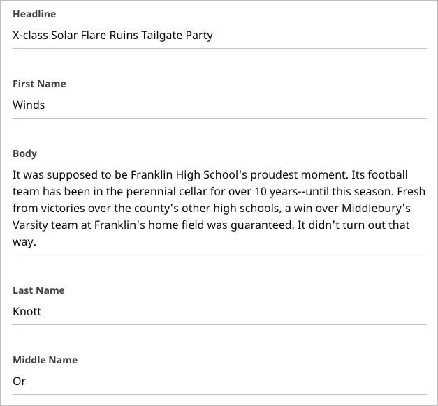

Applies to: Field
By default, Brightspot displays fields in the content edit form in the order they appear in your model. This annotation overrides that sequence, and specifies which field appears first. If more than one field has the @ToolUi.DisplayFirst annotation, Brightspot orders them by occurrence, placing the first annotated field at the top of the form, followed by the second annotated field, and so on.
The following table lists the elements available with this annotation.
| Element |
Description |
Valid Value |
|---|---|---|
| value | Indicates annotated field appears first in content edit form. | true (default), false |
See also @ToolUi.FieldDisplayOrder.
The following snippet includes an example of applying this annotation.
import com.psddev.cms.db.Content;
import com.psddev.cms.db.ToolUi;

public class Article extends Content  {

    private String headline;

    private String body;

    @ToolUi.DisplayFirst
    private String author;

}
In the previous snippet, the default order of fields in the content edit form is headline, body, and author. The annotation @ToolUi.DisplayFirst overrides that order, and places the author field first.


Applies to: Class
Provides filtering controls for other models with the @ToolUi.GlobalFilter annotation when filtering on this model.
The following table lists the elements available with this annotation.
| Element |
Description |
Valid Value |
|---|---|---|
| value | Indicates filtering controls for other models appear when filtering on annotated class. | true (default), false |
The following snippet includes an example of applying this annotation.
import com.psddev.cms.db.Content;
import com.psddev.cms.db.ToolUi;

@ToolUi.DisplayGlobalFilters
public class Author extends Content  {

}-
Specifies that when an editor filters on
Authors, a control appears for filtering on any other model with the@ToolUi.GlobalFilterannotation.
The following snippet illustrates this annotation’s effect when used with @ToolUi.GlobalFilter.
import com.psddev.cms.db.Content;
import com.psddev.cms.db.ToolUi;

@ToolUi.GlobalFilter
public class Article extends Content  {

}-
Specifies that a control for filtering on Articles appears when editors filter on Authors (or on All Content Types).
Clicking on the filter displays a list of items with the same type as in the filter.
Applies to: Field
Specifies that the field appears as a grid in the content edit form. Applies to Set and List fields. In the absence of this annotation, the field’s members appear vertically. If the field is a subclass of a model with a @Recordable.PreviewField annotation, the field specified in that class annotation also appears in the grid.
The following table lists the elements available with this annotation.
| Element | Description | Valid Value |
|---|---|---|
| value | Indicates annotated field appears as a grid. | true (default), false |
The following snippet includes an example of applying this annotation.
import com.psddev.cms.db.Content;
import com.psddev.cms.db.ToolUi;

public class Article extends Content  {

    @ToolUi.DisplayGrid
    private List<StorageItem> slides;

}-
Specifies that the files in a
slidesfield are laid out as a grid in the content edit form.


Applies to: Field
By default, Brightspot displays fields in the content edit form in the order they appear in your model. This annotation overrides that sequence, and specifies which field appears last. If more than one field has the @ToolUi.DisplayLast annotation, Brightspot orders them by occurrence, placing the first annotated field at the end of the form, followed by the second annotated field, and so on.
See also @ToolUi.FieldDisplayOrder.
The following table lists the elements available with this annotation.
| Element | Description | Valid Value |
|---|---|---|
value |
Indicates annotated field appears last in content edit form. | true (default), false |
The following snippet includes an example of applying this annotation.
import com.psddev.cms.db.Content;
import com.psddev.cms.db.ToolUi;

public class Article extends Content  {

    @ToolUi.DisplayLast
    private String author;

    private String headline;

    private String body;

}
In the previous snippet, the default order of fields in the content edit form is author, headline, and body. The annotation @ToolUi.DisplayLast overrides that order, and places the author field last.


Applies to: Field
Renders the field’s options as a drop-down list instead of a selection widget.
If a model’s field is another referenced model, Brightspot renders the field similar to an HTML <select>.
When users open the control, by default Brightspot displays the available objects in a content picker. If this annotation is present, Brightspot instead displays the available objects as a traditional list of options.
The following table lists the elements available with this annotation.
| Element | Description | Valid Value |
|---|---|---|
| value | If true, control rendered as traditional drop-down list. |
true (default), false |
| sortField | Field by which drop-down options are sorted. | Any field name in the model. |
| sortDescending | If true, options sorted in descending order. |
true, false (default) |
The following snippet includes an example of applying this annotation.
import com.psddev.cms.db.Content;
import com.psddev.cms.db.ToolUi;

public class Article extends Content  {

    @ToolUi.DropDown(value=true,sortField="lastName")
    private Author author;

}-
Renders the
Authorfield as a traditional drop-down list.


Applies to: Field, Method
Specifies the class to use for rendering a picker of style variations.
The following table lists the elements available with this annotation.
| Element | Description | Valid Value |
|---|---|---|
| value | Class used to render a style picker. | Any class that implements EmbeddedContentCreator. |
The following snippet includes an example of applying this annotation.
import brightspot.core.lead.Lead;
import com.psddev.cms.db.Content;
import com.psddev.cms.db.ToolUi;
import com.psddev.theme.StyleEmbeddedContentCreator;

public class AnotherArticle extends Content {

    @ToolUi.EmbeddedContentCreatorClass(StyleEmbeddedContentCreator.class)
    private Lead lead;

}-
Renders a style picker for the field
lead.


Applies to: Class
Excludes or includes indexed instances of the annotated content type from results in the search panel. Used with the annotation @Content.Searchable.
The following table lists the elements available with this annotation.
| Element | Description | Valid Value |
|---|---|---|
| value | If
If |
true (default), false |
This annotation is inherited, so models extending from an annotated model have the same setting for @ToolUi.ExcludeFromGlobalSearch.
The following snippets include examples of applying this annotation.
Class excluded from search panel
import com.psddev.cms.db.ToolUi;

@Content.Searchable
@ToolUi.ExcludeFromGlobalSearch
public class Article extends Content {

}-
Ensures Solr indexes instances of
Article. -
Excludes instances of
Articlefrom the results in the search panel.
import com.psddev.cms.db.ToolUi;
import content.article

@Content.ExcludeFromGlobalSearch(false)
public class Recipe extends Article {

}-
Sets
@ToolUi.ExcludeFromGlobalSearchtofalse, reversing the effect of the inherited annotation and including instances ofRecipein the search results. -
Specifies that
Recipeextends fromArticle(the class declared in the snippet Class excluded from search panel). Therefore, Solr indexes instances ofRecipeobjects but excludes them from results in the search panel.
Applies to: Field
Ensures the child form containing the annotated field is never collapsed in the parent content edit form.
This annotation applies to fields with the following characteristics:
- Field is of type
Collection. @Embedded annotation is applied to one of the following:
- The annotated field
- The child model
The following table lists the elements available with this annotation.
| Element |
Description |
Valid Value |
|---|---|---|
| value | Indicates annotated field is always visible in content edit form. | true (default), false |
The following snippet includes an example of applying this annotation.
package content.article;

import com.psddev.cms.db.Content;
import com.psddev.cms.db.ToolUi;

public class Author extends Content {

    private String lastName;

    private String firstName;

}-
Declares a child model
Authorwith two fields:lastNameandfirstName.
The following snippet illustrates applying this annotation to the child model.
import com.psddev.cms.db.Content;
import com.psddev.cms.db.ToolUi;

public class Article extends Content  {

    @Embedded
    @ToolUi.Expanded
    private List<Author> authors;

}-
Declares a parent model
Articlethat contains the child modelAuthor. -
Embeds the child model.
-
Ensures the form for entering an author is always expanded.
-
Declares a field subclassed from
Collection<record>.


In the previous image, the two forms containing the embedded field Author are always expanded in the content edit form.
Applies to: Class
Specifies the enum to use for rendering sort options for items retrieved from federated searches in the search panel.
The following table lists the elements available with this annotation.
| Element | Description | Valid Value |
|---|---|---|
| value | Enum used to render sort options. | Any enum that implements ExternalItemSort. |
Implementing this annotation requires the following steps.
Step 1: Identify native sort options
Review the external source’s API documentation for the available sort options, and determine the corresponding labels you want to use in the search panel. For example, the following table lists the available sort options from Getty Images and recommended labels in Brightspot.
| Getty native |
Brightspot label |
|---|---|
| best_match | Best Match |
| most_popular | Most Popular |
| newest | Newest |
| random | Random |
Step 2: Declare enum with sort options
Enum for sorting external items
import com.psddev.cms.tool.ExternalItemSort;
import com.psddev.dari.db.Query;
import com.psddev.dari.util.StringUtils;

public enum ProviderSort implements ExternalItemSort {

    BEST_MATCH,
    MOST_POPULAR,
    NEWEST,
    RANDOM;

    @Override
    public String getOperator() {
        return name();
    }

    @Override
    public String toString() {
        return StringUtils.toLabel(name());
    }

    @Override
    public void sort(Query<?> query) {
        /* Optional custom sort function. */
    }

}-
Declares sort options.
-
Implements the method
getOperator. Brightspot places the result of this method in the data-value attribute of an element. -
Overrides the Object.toString method. Brightspot places the result of this method as the value of a tag. This example uses Dari’s
StringUtils#toLabelmethod; see StringUtils for other available string manipulation methods. -
Optionally overrides the sorting of the sort options. The default sorting is by the results of the method getOperator.
Step 3: Apply enum with annotation
package article;

import com.psddev.cms.db.ExternalItem;
import com.psddev.cms.db.ToolUi;
import com.psddev.dari.db.Recordable;
import com.psddev.id.SomeDatabaseProvider;

@Recordable.SourceDatabaseProviderClass(SomeDatabaseProvider.class)
@ToolUi.ExternalItemSortClass(ProviderSort.class)
public class SomeImageProvider extends ExternalItem {

}-
Specifies the class providing the connection to the external provider.
-
Applies the sorted labels using the
enumdefined in the snippet "Enum for sorting external items."
The following image illustrates how Brightspot renders the sort labels.


See also:
Applies to: Class
Indicates the order in which fields appear in the content edit form. Overrides @ToolUi.DisplayLast. Fields not appearing in this annotation appear in the order as in the model or as otherwise annotated.
The following table lists the elements available with this annotation.
| Element | Description | Valid Value |
|---|---|---|
| value | Order by which fields appear in the content edit form. | Array of strings representing the model’s fields. |
The following snippet includes an example of applying this annotation.
import com.psddev.cms.db.Content;
import com.psddev.cms.db.ToolUi;

@ToolUi.FieldDisplayOrder({"author", "headline", "body"})
public class Article extends Content  {

    private String headline;

    private String body;

    private String author;

}-
Specifies that the first three fields in the content edit form are
author,headline, andbody(in that order).


Applies to: Class
Indicates which fields appear in an asset's Quick View widget.
The following table lists the elements available with this annotation.
| Element | Description | Valid Value |
|---|---|---|
| value | Fields appearing in an asset's Quick View widget. | Array of strings representing the model’s fields. |
The following snippet includes an example of applying this annotation.
import com.psddev.cms.db.Content;
import com.psddev.cms.db.ToolUi;

@ToolUi.FieldDisplayPreview({"headline"})
public class Article extends Content {

    private String headline;

    private String subHeadline;
}-
Specifies that the field
headlineappears in the Quick View widget for objects of typeArticle.


Referring to the previous illustration, the Quick View widget includes the article's headline field but not the subheadline field, as indicated in the annotation @ToolUi.FieldDisplayPreview.
Applies to: Field
Overrides the field’s default rendering with that of another type. You can use this annotation to perform pre-processing on the field before committing it to the database.
The following table lists the elements available with this annotation.
| Element | Description | Valid Value |
|---|---|---|
| value | Data type by which annotated field is rendered. | One of the following strings:
|
The following snippet includes an example of applying this annotation.
import com.psddev.cms.db.Content;
import com.psddev.cms.db.ToolUi;

public class Author extends Content  {

    @ToolUi.FieldDisplayType("password")
    private String yourPassword;

}-
Renders the
Stringfield as a password changer.


Applies to: Field
Freezes the order in which entries in a Set field appear. Without this annotation, Brightspot displays the entries in a random order.
The following table lists the elements available with this annotation.
| Element | Description | Valid Value |
|---|---|---|
| value | Indicates members of annotated field appear in a fixed sort order. | true (default), false |
The following snippet includes an example of applying this annotation.
import com.psddev.cms.db.Content;
import com.psddev.cms.db.ToolUi;

public class Article extends Content  {

    @ToolUi.FieldSorted
    private Set<Author> authors;

}-
Specifies that when displaying an
Articlein the content edit form, the order of listed authors does not change.


The previous illustration indicates that when displaying authors, the order of appearance is Christie, Picoult, and Twain—even if the editor originally selected the authors in a different order.
Applies to: Field
Displays in the search panel a filtering option for this field when filtering on the field’s model. Requires the @Indexed annotation.
Without this annotation, non-string fields with the @Indexed annotation appear as a filter in the search panel. You can show or hide the filter with this annotation.
The following table lists the elements available with this annotation.
| Element | Description | Valid Value |
|---|---|---|
| value | Indicates if filtering is available on this field. |
Use |
The following snippet includes an example of applying this annotation.
import com.psddev.cms.db.Content;
import com.psddev.cms.db.ToolUi;

public class Author extends Content  {

    @ToolUi.Filterable
    @Indexed
    private String headline;

    @Indexed
    private String body;

    @Indexed
    private Author author;

    @ToolUi.Filterable(false)
    @Indexed
    private Image image;

}
The following table describes the annotations in the previous snippet.
| Field | Default Behavior | Annotated Behavior |
|---|---|---|
headline |
Because headline is a string, Brightspot does not display a filter control in the search panel for this field when the primary filter is Article. |
With the annotation @ToolUi.Filterable, Brightspot overrides the default behavior and displays a filter control in the search panel for this field when the primary filter is Article. |
body |
Because body is a string, Brightspot does not display a filter control in the search panel for this field when the primary filter is Article. |
N/A |
author |
Because author is not a string and is annotated with @Indexed, Brightspot displays a filter control for this field in the search panel when the primary filter is Article. |
N/A |
image |
Because image is not a string and is annotated with @Indexed, Brightspot displays a filter control for this field in the search panel when the primary filter is Article. |
With the annotation @ToolUi.Filterable(false), Brightspot overrides the default behavior and suppresses a filter control in the search panel for this field when the primary filter is Article. |
Applies to: Class
Provides an additional control for filtering on the annotated model when filtering by All Content Types in the search panel.
The following table lists the elements available with this annotation.
| Element | Description | Valid Value |
|---|---|---|
| value | Indicates filtering control is available for annotated model when filtering by All Content Types. | true (default), false |
The following snippet includes an example of applying this annotation.
import com.psddev.cms.db.Content;
import com.psddev.cms.db.ToolUi;

@ToolUi.GlobalFilter
public class Article extends Content  {

}-
Displays a control for filtering by Articles when an editor is filtering search results by All Content Types.
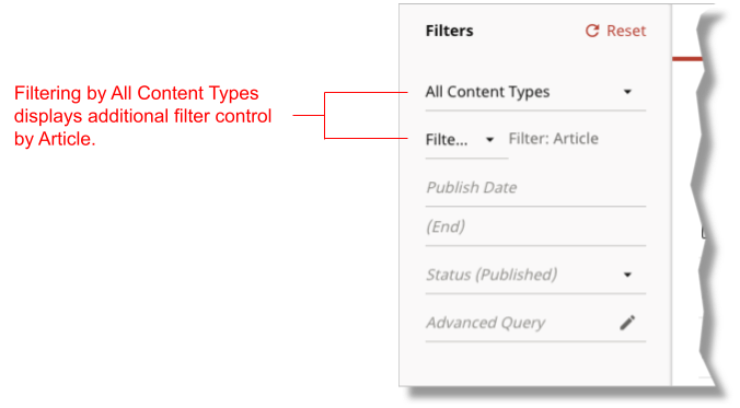

You can also have the control appear when filtering on specific models; for details, see @ToolUi.DisplayGlobalFilters.
Deprecated. Use @ToolUi.Cluster.
Applies to: Field, Class
Suppresses display of the annotated field or class. When applied to a field, Brightspot suppresses display of the field in the content edit form; when applied to a class, Brightspot suppresses display of the model in the Create drop-down list—preventing editors from creating a new instance of the current model.
The following table lists the elements available with this annotation.
| Element | Description | Valid Value |
|---|---|---|
| value | Indicates Brightspot suppresses display of annotated class or field. | true (default), false |
The following snippet includes an example of applying this annotation.
import com.psddev.cms.db.Content;
import com.psddev.cms.db.ToolUi;

public class Article extends Content  {

    private String headline;

    @ToolUi.Hidden
    private String author;

    private String body;

}-
Suppresses display of the
authorfield in the content edit form.


Applies to: Class
Specifies the icon associated with the annotated model in the Quick Start widget.
The following table lists the elements available with this annotation.
| Element | Description | Valid Value |
|---|---|---|
| value | Name of the icon Brightspot displays in the Quick Start widget. | Any identifier in the Material Icons. Defaults to add_circle_outline (). |
| mode | Rotates the icon. | One of the following:
Defaults to no rotation. |
The following snippet includes an example of applying this annotation.
import com.psddev.cms.db.Content;
import com.psddev.cms.db.ToolUi;

@ToolUi.IconName(value="face")
public class Author extends Content  {

}-
Displays Material Design’s face icon for the content type
Authorin the Quick Start widget.


See also:
Applies to: Field
Specifies path to the processor used to render and update the target field. This annotation is typically used for customized field processing and rendering instead of using the default field renderer.
The following table lists the elements available with this annotation.
| Element | Description | Valid Value |
|---|---|---|
| value | Path to servlet. The path starts from a root at the following locations:
|
String. |
| application | Component for constructing path to appropriate servlet. At run time, Brightspot typically prepends this value to the value for value to construct the entire path to the servlet. | String. Default is a zero-length string (""). |
The following snippet includes an example of applying this annotation.
import com.psddev.cms.db.Content;
import com.psddev.cms.db.ToolUi;

public class Video extends Content {

    @ToolUi.InputProcessorPath("/path/duration.jsp")
    @ToolUi.ReadOnly
    private Long duration;

}-
Specifies the path to the widget used to compute a video’s duration. Inside the Brightspot express project, the file’s path is
brightspot/express/frontend/src/main/webapp/path/duration.jsp.
See also:
Applies to: Field
Specifies path to the widget that provides search results for the target field.
The following snippet includes an example of applying this annotation.
import com.psddev.cms.db.Content;
import com.psddev.cms.db.ToolUi;

public class Article extends Content {

    @ToolUi.InputSearcherPath("/path/searchWidget.jsp")
    private Author author;

}-
Specifies the path to the widget for retrieving matching authors.
Applies to: Field
Sets the lang attribute of the div containing a String field.
The following table lists the elements available with this annotation.
| Element | Description | Valid Value |
|---|---|---|
| value | Language-region pair applied to the annotated field. | Any language-region par as listed in IANA Language Subtag Registry. |
The following snippet includes an example of applying this annotation.
import com.psddev.cms.db.Content;
import com.psddev.cms.db.ToolUi;

public class Article extends Content  {

    @ToolUi.LanguageTag("en-US")
    private String body;

}-
Sets the
langattribute of thedivcontaining the body’stextareaelement in the content edit form toen-US.
<div lang="en-US">
    <div>
        <!-- Definition of field label -->
    </div>
    <div>
        <textarea></textarea>
    </div>
</div>
Deprecated. No replacement.
Deprecated. No replacement.
Deprecated. No replacement.
Applies to: Class
Places a model in the MAIN CONTENT TYPES group of the search panel’s Create drop-down list.
By default, Brightspot places any model implementing Directory.Item in the MAIN CONTENT TYPES group of the Create drop-down list, and places models not implementing that interface in the MISC CONTENT TYPES group. This annotation places models not implementing Directory.Item in the MAIN CONTENT TYPES group.
The following table lists the elements available with this annotation.
| Element | Description | Valid Value |
|---|---|---|
| value | Lists model in the MAIN CONTENT TYPES in the Create drop-down list. | true (default), false |
The following snippet includes an example of applying this annotation.
import com.psddev.cms.db.Content;
import com.psddev.cms.db.Directory;

public class Author extends Content implements Directory.Item {

}-
Indicates that Author appears in the MAIN CONTENT TYPES group of the Create drop-down list, because this model implements
Directory.Item.
import com.psddev.cms.db.Content;
import com.psddev.cms.db.ToolUi;

@ToolUi.Main
public class Article extends Content  {

}-
Indicates that Article appears in the MAIN CONTENT TYPES group of the Create drop-down list, even though this model does not implement
Directory.Item.
import com.psddev.cms.db.Content;
public class Gallery extends Content {

}
In the previous snippet, the model Gallery does not implement Directory.Item and has no annotation, so it appears in the MISC CONTENT TYPES group of the Create drop-down list.


Deprecated. Use @Note.
Deprecated. Use @DynamicNoteClass, @DynamicNoteMethod, or @HtmlNote.
Deprecated. Use @DynamicNoteClass, @DynamicNoteMethod.
Applies to: Field
Displays in the search panel only those items with a permalink—guaranteeing that an editor references a live item and does not create a dead link.
This annotation applies to fields satisfying the following conditions:
- Reference models that implement
Directory.Item. - Reference instances with a saved and published permalink.
The following table lists the elements available with this annotation.
| Element | Description | Valid Value |
|---|---|---|
| value | Indicates selections for annotated field must have a permalink. | true (default), false |
The following snippet includes an example of applying this annotation.
import com.psddev.cms.db.Content;
import com.psddev.cms.db.ToolUi;

public class Article extends Content  {

    @ToolUi.OnlyPathed
    private Author author;

}-
Displays in the search panel only those published authors with permalinks.
Applies to: Class
Enables the annotated class to have permissions, and to appear in the Permissions accordion of the Tool Role or Tool User widget. The annotated class must extend from Record.
The following table lists the elements available with this annotation.
| Element | Description | Valid Value |
|---|---|---|
| value | Indicates access to annotated class in the Brightspot UI is determined by permissions. | true (default), false |
The following snippet includes an example of applying this annotation.
import com.psddev.cms.db.ToolUi;
import com.psddev.dari.db.Record;

@ToolUi.Permissionable
public class RichTextHat extends Record {
    /* Class definition */
}-
Renders the annotated class in the Permissions accordion of the Tool Role or Tool User widget.
-
Declares a class
RichTextHatthat extends fromRecord. Brightspot renders such classes as Other Type in a permissions form. Brightspot renders a class extending fromContentas Content Type in a permissions form.
Applies to: Class
Indicates if the class is publishable. If this annotation is absent, the class is publishable.
The following table lists the elements available with this annotation.
| Element |
Description |
Valid Value |
|---|---|---|
| value |
Indicates annotated class is publishable. |
true (default), false |
The following snippet includes an example of applying this annotation.
import com.psddev.cms.db.Content;
import com.psddev.cms.db.ToolUi;

@ToolUi.Publishable(false)
public class Article extends Content  {

}-
Indicates that no articles are publishable. The text inside the editorial toolbar changes to Save.


Applies to: Class
Specifies the text appearing on the publish button in the model’s content edit form. If annotation is absent, Brightspot uses the default text Publish.
The following table lists the elements available with this annotation.
| Element | Description | Valid Value |
|---|---|---|
| value | Label for Publish button. | Any string. |
The following snippet includes an example of applying this annotation.
import com.psddev.cms.db.Content;
import com.psddev.cms.db.ToolUi;

@ToolUi.PublishButtonText("Print it!")
public class Article extends Content  {

}-
Specifies that
Print It!appears on the publish button for articles.


Applies to: Field, Class
Specifies the annotated item is read-only. When applied to a field, the annotated field is read only. When applied to a class, the model is read only: editors cannot modify instances of the model, and cannot create new instances.
The following table lists the elements available with this annotation.
| Element | Description | Valid Value |
|---|---|---|
| value | Indicates annotated class or field is read-only on content edit form. | true (default), false |
The following snippet includes an example of applying this annotation.
import com.psddev.cms.db.Content;
import com.psddev.cms.db.ToolUi;

public class Article extends Content  {

    private String headline;

    @ToolUi.ReadOnly
    private String author;

}-
Specifies that
Authoris read-only on the content edit form.

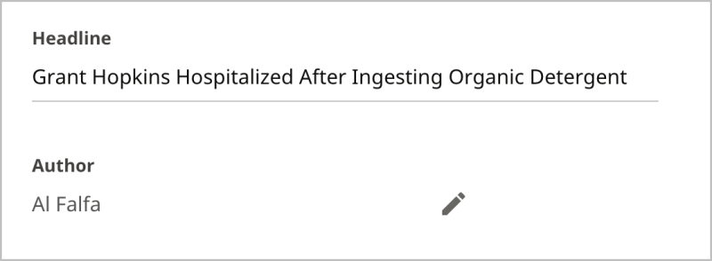
Applies to: Field
Renders a String field as a rich-text editor.
The following table lists the elements available with this annotation.
| Element | Description | Valid Value |
|---|---|---|
| value | If true, field rendered as a rich-text editor. |
true (default), false |
| inline | If
If |
true (default), false. Must be false if block in the @RichTextElement.Tag annotation is true. |
| toolbar | Renders the rich-text editor’s toolbar using the specified class. | Any class that implements RichTextToolbar. Defaults to DefaultRichTextToolbar.class. Brightspot provides the following implementing classes:
For information about creating your own rich-text toolbars and elements, see Rich text. |
The following snippet includes an example of applying this annotation.
import com.psddev.cms.db.Content;
import com.psddev.cms.db.ToolUi;
import brightspot.core.tool.SmallRichTextToolbar;

public class Article extends Content  {

    @ToolUi.RichText(toolbar = SmallRichTextToolbar.class)
    private String body;

}-
Renders the field body as a rich-text editor using the small version of the default toolbar.


Applies to: Field
Hides the annotated String field’s value; a Show Secret/Hide Secret control toggles the field’s value in cleartext.
The following table lists the elements available with this annotation.
| Element | Description | Valid Value |
|---|---|---|
| value | Indicates annotated field toggles between a password and cleartext display. | true (default), false |
The following snippet includes an example of applying this annotation.
import com.psddev.cms.db.Content;
import com.psddev.cms.db.ToolUi;

public class Article extends Content  {

    @ToolUi.Secret
    private String password;

}-
Hides the password field’s value.
This annotation does not provide encryption when sending to or receiving from the server. To encrypt a field’s value, use @ToolUi.FieldDisplayType("password"). For details, see @ToolUi.FieldDisplayType.
Applies to: Field
Indicates search results can be sorted by the annotated String field when filtering on the corresponding model.
The following table lists the elements available with this annotation.
| Element | Description | Valid Value |
|---|---|---|
| value | Indicates search results can be sorted by annotated field. | true (default), false |
The following snippet includes an example of applying this annotation.
import com.psddev.cms.db.Content;
import com.psddev.cms.db.ToolUi;

public class Article extends Content  {

    @ToolUi.Sortable
    private String headline;

}-
Indicates users can sort search results by headline when filtering on Articles.


Applies to: Field
Specifies path to the servlet used to generate a StorageItem’s preview in the content edit form. If absent, Brightspot uses the method FileField#processField.
FileContentType#writePreview.
The following table lists the elements available with this annotation.
| Element | Description | Valid Value |
|---|---|---|
| value | Path to servlet. | String. |
| application | Component for constructing path to appropriate servlet. At run time, Brightspot typically prepends this value to the value for value to construct the entire path to the servlet. | String. Default is a zero-length string (""). |
The following snippet includes an example of applying this annotation.
import com.psddev.cms.db.Content;
import com.psddev.cms.db.ToolUi;

public class Article extends Content  {

    @ToolUi.StoragePreviewProcessorPath("/WEB-INF/_plugins/myCustomFilePreview.jsp")
    private StorageItem leadImage;

}-
Specifies the path to the JSP servlet that generates the
leadImage’s preview in the content edit form.
Applies to: Field
Specifies the storage location for uploadable files. This annotation is useful if you want to save specific StorageItems on a dedicated server. This annotation requires a string identifying the storage location.
The following table lists the elements available with this annotation.
| Element | Description | Valid Value |
|---|---|---|
| value | Storage location for files uploaded through the annotated field. | String representation of a storage location configured in context.xml. |
Some Brightspot deployments declare two locations for storing StorageItems. For example, the following snippet from a context.xml declares two storage locations: primary and secondary.
<!-- Storage Item Settings  -->
<Environment name="dari/defaultStorage" type="java.lang.String" value="primary" />

<Environment name="dari/storage/primary/class" type="java.lang.String" value="com.psddev.dari.util.LocalStorageItem" />
<Environment name="dari/storage/primary/rootPath" type="java.lang.String" value="/servers/mysite/www/primary" />
<Environment name="dari/storage/primary/baseUrl" type="java.lang.String" value="/primary" />

<Environment name="dari/storage/secondary/class" type="java.lang.String" value="com.psddev.dari.util.LocalStorageItem" />
<Environment name="dari/storage/secondary/rootPath" type="java.lang.String" value="/servers/mysite/www/secondary" />
<Environment name="dari/storage/secondary/baseUrl" type="java.lang.String" value="/secondary" />-
Specifies
primaryas the default storage location. -
Defines the URL for storage location
primary. -
Defines the URL for storage location
secondary.
Because primary is the default storage location, Brightspot never uses secondary unless overridden in a @ToolUi.StorageSetting annotation.
import com.psddev.cms.db.Content;
import com.psddev.cms.db.ToolUi;

public class Article extends Content  {

    @ToolUi.StorageSetting("secondary")
    private StorageItem image;

}-
Specifies that all objects associated with the image field are stored in the secondary location specified in the project’s
context.xmlfile.
Applies to: Field
Suggested maximal number of characters in a String field. Brightspot retains the entire string even if longer than the suggested maximum.
The following table lists the elements available with this annotation.
| Element | Description | Valid Value |
|---|---|---|
| value | Suggested maximal number of characters in annotated field. | Any double ≥ 0. |
The following snippet includes an example of applying this annotation.
import com.psddev.cms.db.Content;
import com.psddev.cms.db.ToolUi;

public class Article extends Content  {

    @ToolUi.SuggestedMaximum(30)
    private String headline;

}-
Specifies a suggested maximal length of 30 characters in the headline. When a user types more than 30, Brightspot displays a warning message.


Applies to: Field
Suggested minimal number of characters in a String field. Brightspot retains the string even if shorter than the suggested minimum.
The following table lists the elements available with this annotation.
| Element | Description | Valid Value |
|---|---|---|
| value | Suggested minimal number of characters in annotated field. | Any double ≥ 0. |
The following snippet includes an example of applying this annotation.
import com.psddev.cms.db.Content;
import com.psddev.cms.db.ToolUi;

public class Article extends Content  {

    @ToolUi.SuggestedMinimum(10)
    private String headline;

}-
Specifies a suggested minimal length of 10 characters for the headline. Brightspot displays a warning message in the field until the user types 10 characters.


Applies to: Field
Based on an object’s content, this annotation a) provides suggested selections for drop-down lists, and b) provides recommended results in the content picker. Applies to fields referencing other models.
When an editor opens a drop-down list with this annotation, Brightspot sends the current state of the object to the search platform for analysis. The server responds with suggested selections based on the model’s content and active drop-down list. For example, an editor enters the headline Bravest Soldiers I've Known and opens the Section drop-down list. Brightspot provides a list of suggested sections in which to publish the article based on other articles already published in those sections.
This annotation becomes active after your Brightspot project reaches a certain volume of content.
The following table lists the elements available with this annotation.
| Element | Description | Valid Value |
|---|---|---|
| value | Indicates Brightspot provides suggestions for the annotated field based on existing published content. | true (default), false |
The following snippet includes an example of applying this annotation.
import com.psddev.cms.db.Content;
import com.psddev.cms.db.ToolUi;

public class Article extends Content  {

    @ToolUi.Suggestions
    private Section section;

}-
Provides suggested selections when the user opens the Section field.
In the following illustration, Brightspot displays suggested names of sections. The suggested names are influenced by the story’s content.


Applies to: Field
Indicates under which custom tab the field appears in the content edit form. If the tab does not exist, Brightspot creates it. Fields without this annotation appear as follows:
- In an unlabeled widget if there are no other tabs.
- In the Main tab if there are other tabs.
Tabs appear left-to-right in the order they first appear in the model; you can override this order using the annotation @ToolUi.TabDisplayOrder.
The following table lists the elements available with this annotation.
| Element | Description |
Valid Value |
|---|---|---|
| value | Label for tab under which annotated field appears. | Any string. |
The following snippet includes an example of applying this annotation.
import com.psddev.cms.db.Content;
import com.psddev.cms.db.ToolUi;

public class Article extends Content  {

    @ToolUi.Tab("Markets")
    private String state;

    @ToolUi.Tab("Markets")
    private String county;

    @ToolUi.Tab("Markets")
    private String city;

}-
Specifies that the fields state, county, and city appear under the Markets tab in the content edit form.
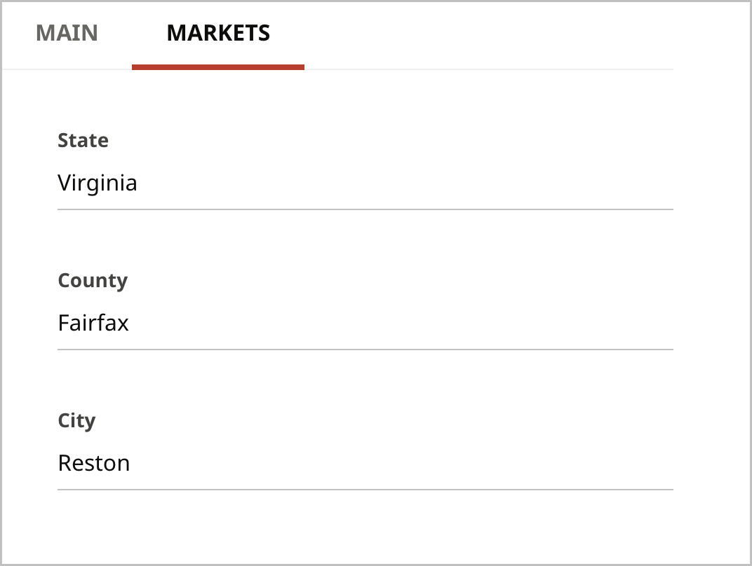

Applies to: Class
Specifies the order in which custom tabs appear in the content edit form.
By default, Brightspot displays custom tabs (the tabs you declare with @ToolUi.Tab) in the order in which they appear in the model. Using this annotation, you can specify which tab appears first and which tab appears last. Regardless of these annotations, Brightspot always places the tab Main first, and displays other system-level tabs such as SEO last.
The following table lists the elements available with this annotation.
| Element | Description | Valid Value |
|---|---|---|
| start | Leftmost tabs on the content edit form (after the Main tab). Brightspot displays the tabs in the order as they appear in the array, so start={"Soda Pop","Mineral Water"} displays the tab Soda Pop and then the tab Mineral Water. |
Array of strings, the elements of which are parameters to the annotation @ToolUi.Tab. |
| end | Rightmost tabs on the content edit form. Brightspot displays the tabs in the order as they appear in the array, so If the same tab is passed to start and end, the layout specified by end has higher priority. |
Array of strings, the elements of which are parameters to the annotation @ToolUi.Tab. |
The following snippet includes an example of applying this annotation.
import com.psddev.cms.db.Content;
import com.psddev.cms.db.ToolUi;

@ToolUi.TabDisplayOrder(end = {"Markets"})
public class Article extends Content{

    private String headline;
    private String body;
    private String author;

    @ToolUi.Tab("Markets")
    private String state;

    @ToolUi.Tab("Markets")
    private String county;

    @ToolUi.Tab("Markets")
    private String city;

    @ToolUi.Tab("Demographics")
    private String gender;

    @ToolUi.Tab("Demographics")
    private String age;

    @ToolUi.Tab("Demographics")
    private String occupation;
}-
Specifies that the rightmost custom tab is Markets, overriding the default that Demographics is the rightmost custom tab.
-
Defines three fields without a
@ToolUi.tabannotation; these fields appear under the tab Main. -
Defines three fields appearing under the custom tab Markets. By default, Markets is the leftmost tab because it is appears first in the model.
-
Defines three fields appearing under the custom tab Demographics.
Applies to: Field, method
For embedded classes with a single field, this annotation hides that field's label. The embedded class must not extend Content.
The following table lists the elements available with this annotation.
| Element | Description | Valid Value |
|---|---|---|
| value | Suppresses annotated field’s label. | true (default), false |
The following snippet includes an example of applying this annotation.
@Recordable.Embedded
public class ExampleChild extends Record {

    @ToolUi.Unlabeled
    private String myStringField;

}

public class ExampleParent extends Content {

    private ExampleChild myEmbeddedField;

}-
Declares an embedded class with a single text field.
-
Suppresses the label My String Field in the content edit form.
-
Declares a parent class with a field of type
ExampleChild.
The following examples illustrate the effect of this annotation.
  Child class without @ToolUi.Unlabeled annotation
|
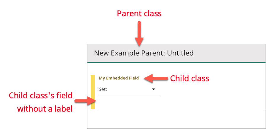  Child class with @ToolUi.Unlabeled annotation
|
Applies to: Field.
Populates a drop-down list with properties available in the current page.
The following table lists the elements available with this annotation.
| Element | Description | Valid Value |
|---|---|---|
| value | Class used to extract values from the current context. | Any class that implements ValueGenerator. |
Implementing this annotation requires the following steps.
Step 1: Declare a ValueGenerator class
Declare a class that implements ValueGenerator. This interface includes a method generate that has access to the currently displayed page in Brightspot.
import com.psddev.cms.db.Site;
import com.psddev.cms.db.ValueGenerator;
import com.psddev.cms.tool.ToolPageContext;

public class SiteListValueGenerator implements ValueGenerator {

    @Override
    public List<Value> generate(ToolPageContext page, Object object, String input) {
        List<Site> otherAccessibleSites = page.findOtherAccessibleSites();
        return otherAccessibleSites.stream()
                .map(e -> {
                    Value value = new ValueGenerator.Value();
                    value.setLabel(e.getLabel());
                    value.setValue(e.getId().toString());
                    return value;
                })
                .collect(Collectors.toList());
    }
}-
Declares a class that implements
ValueGenerator. -
Method that returns a list of sites to which the current user has access excluding the current site.
-
Retrieves the sites to which the user has access other than the current site.
-
Constructs a list of those sites using the sites’ label and ID.
Step 2: Declare a field annotated with the class
In a model, declare a List or Set field annotated with the class from Step 1.
import com.psddev.cms.db.Content;
import com.psddev.cms.db.ToolUi;

public class ArticleWithDynamicList extends Content {

    private String headline;

    @ToolUi.ValueGeneratorClass(SiteListValueGenerator.class)
    private Set<String> additionalSitesForPublication;

}-
Populates the list with the results from the method
SiteListValueGenerator#generateimplemented in Step 1. -
Declares a drop-down list of sites from which an editor can select to publish an item.


You can view the list of annotations used in or available for a model.
To view a model’s available annotations:
- Open or create a new item based on the model whose annotations you want to view.
- In the editorial toolbar, click , and select Tools. The Tools widget appears.
- Under For Developers, scroll down to Present Annotations and Possible Annotations.


Some annotations can generate dynamic text using Java’s Expression Language (EL). Brightspot provides the following objects you can use in EL statements:
- content—Reference to the object that contains the annotated field.
- ObjectField field—Annotated field’s ObjectField.
- ToolPageContext toolPageContext—General object for accessing the UI.