Data modeling for themes
With Styleguide you can add fields to individual templates so that the fields appear in the associated content edit forms. This feature helps expedite the development process by allowing front-end developers to do data modeling without involving back-end developers.
themeFields configuration key. For details, see Theme fields.
Use the following general steps to add a field to a Model for a specific theme.
- Change to the theme's Styleguide directory:
cd brightspot-themes-frost/. - Start the theme's Styleguide server:
yarn styleguide. - Open the theme's configuration file
styleguide/_config.json. - Add members to the
styleskey and save the file. The Styleguide server recompiles and packages the updated theme in a file/themes/<theme-directory>/target/brightspot-theme-<identifier>-SNAPSHOT.zip. - Upload the updated theme's .zip file to the Brightspot server; for details, see Uploading a theme.
- Reload Brightspot in the browser. Upon reload, Brightspot detects the updated theme and loads it as well.
The following sections describe how to add various field types through a theme's configuration file.
Boolean fields appear as checkboxes. Open the theme's configuration file _config.json, and add a boolean entry under the template's styles key.
{
  "styles": {
    "pathToTemplateFile.hbs": {
      "fields": {
        "publicDomain": {
          "type": "boolean"
        }
      }
    }
  }
}
The new field appears by default under the Overrides tab.


Color fields appear as a color picker. Open the theme's configuration file _config.json, and add a color entry under the template's styles key.
{
  "styles": {
    "pathToTemplateFile.hbs": {
      "fields": {
        "textColor": {
          "type": "color"
        }
      }
    }
  }
}
The new field appears by default under the Overrides tab.


Date fields appear as a date picker. Open the theme's configuration file _config.json, and add a date entry under the template's styles key.
{
  "styles": {
    "pathToTemplateFile.hbs": {
      "fields": {
        "dateOfBirth": {
          "type": "date"
        }
      }
    }
  }
}
The new field appears by default under the Overrides tab.


A location field appears as a map of a user's location. Open the theme's configuration file _config.json, and add a location entry under the template's styles key.
{
  "styles": {
    "pathToTemplateFile.hbs": {
      "fields": {
        "targetLocation": {
          "type": "location"
        }
      }
    }
  }
}
The new field appears by default under the Overrides tab.
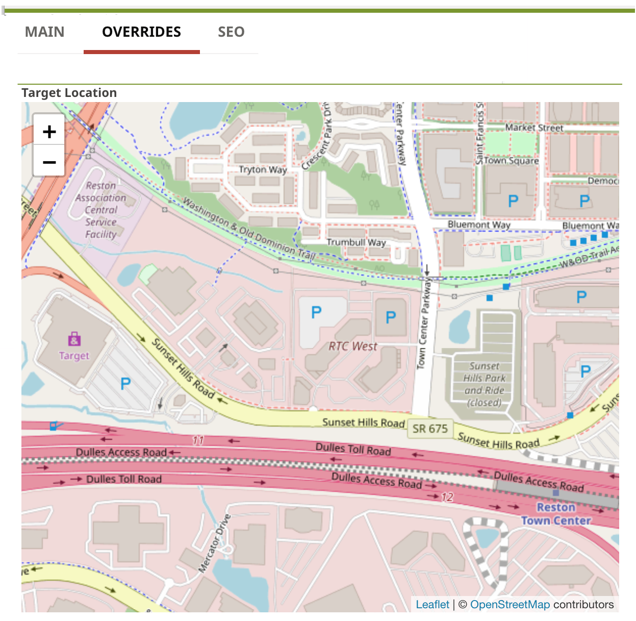

Number fields appear as text boxes. Open the theme's configuration file _config.json, and add a number entry under the template's styles key.
{
  "styles": {
    "pathToTemplateFile.hbs": {
      "fields": {
        "quantity": {
          "type": "number"
        }
      }
    }
  }
}
The new field appears by default under the Overrides tab.


Record fields appear as a selection field. Open the theme's configuration file _config.json, and add a record entry under the template's styles key. As a best practice, add a groups entry to limit the type of record the user can select.
{
  "styles": {
    "pathToTemplateFile.hbs": {
      "fields": {
        "relatedArticle": {
          "type": "record",
          "groups": "brightspot.core.article.Article"
        }
      }
    }
  }
}
The new field appears by default under the Overrides tab.


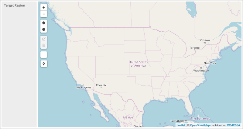
A region field appears as a map in which users can draw circles and polygons. Open the theme's configuration file _config.json, and add a region entry under the template's styles key.
{
  "styles": {
    "pathToTemplateFile.hbs": {
      "fields": {
        "targetRegion": {
          "type": "region"
        }
      }
    }
  }
}
The new field appears by default under the Overrides tab.

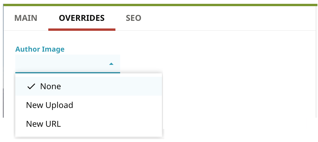
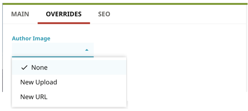
Storage items appear as file selection controls. Open the theme's configuration file _config.json, and add a file entry under the template's styles key.
{
  "styles": {
    "pathToTemplateFile.hbs": {
      "fields": {
        "authorImage": {
          "type": "file"
        }
      }
    }
  }
}
The new field appears by default under the Overrides tab.
String fields can appear as text boxes or a list of strings. For a text box, open the theme's configuration file _config.json, and add a text entry under the template's styles key.
{
  "styles": {
    "pathToTemplateFile.hbs": {
      "fields": {
        "attribution": {
          "type": "text"
        }
      }
    }
  }
}
The new field appears by default under the Overrides tab.


For a list of strings, open the theme's configuration file _config.json, and add a list/text entry under the template's styles key.
{
  "styles": {
    "pathToTemplateFile.hbs": {
      "fields": {
        "attribution": {
          "type": "list/text"
        }
      }
    }
  }
}
The new field appears by default under the Overrides tab.


You can use options to customize fields you add through Styleguide. The options modify a field’s appearance or behavior. The following sections list the available options and how to implement them.
Overview of adding field options
Use the following general steps to add a field option to a Model for a specific theme.
- Start an instance of Brightspot.
- Change to the theme's Styleguide directory:
cd themes/<theme-directory>/. - Start the theme's Styleguide server:
gulp styleguide. - Open the theme's configuration file
styleguide/_config.json. - Add members to the styles key and save the file. The Styleguide server recompiles and packages the updated theme in a file themes
//target/brightspot-theme--SNAPSHOT.zip. - Upload the updated theme's .zip file to the Brightspot server; for details, see Uploading a theme.
- Reload Brightspot in the browser. Upon reload, Brightspot detects the updated theme and loads it as well.
The following sections describe how to add various field options through a theme's configuration file.
cms.ui.cluster
Displays a heading above the field. Useful for grouping fields under a heading.
{
  "primaryContributor": {
    "type": "record",
    "cms.ui.cluster": "Freelance author information"
  },
  "contributorBio": {
    "type": "text"
  },
}
For additional information, see @ToolUi.Cluster.
cms.ui.cssClass
Renders the field using the provided CSS class.
{
  "approvedBy": {
    "type": "text",
    "cms.ui.cssClass": "text-green-bold"
  }
}
You can define the CSS class in the Brightspot settings for the global site. Under Debug, set the Extra CSS field for example:


The rendered result appears as follows:


For additional information, see @ToolUi.CssClass.
cms.ui.dropDown
Displays a list with specified values.
{
  "Alignment": {
    "type": "text",
    "cms.ui.dropDown": true,
    "values": [
      {
        "label": "Left Alignment",
        "value": "alignleft"
      },
      {
        "label": "Center Alignment",
        "value": "aligncenter"
      },
      {
        "label": "Right Alignment",
        "value": "alignright"
      }
    ]
  }
}
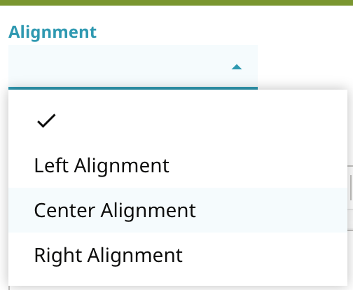

For additional information, see @ToolUi.DropDown.
cms.ui.note
Displays explanatory note below the field.
{
  "articleBody": {
    "type": "text",
    "cms.ui.richText": true,
    "cms.ui.note": "Please, no more than 200 words."
  }
}

cms.ui.placeholder
Displays default placeholder text inside a text field.
{
  "breakingHeadline": {
    "type": "text",
    "cms.ui.placeholder": "Breaking news: "
  }
}
For additional information, see @ToolUi.Placeholder.
cms.ui.richText
Renders a text field as a rich-text editor.
{
  "freelancerBio": {
    "type": "text",
    "cms.ui.richText": true
  }
}

For additional information, see @ToolUi.RichText.
cms.ui.secret
Hides the text field's value; a Show Secret/Hide Secret control toggles the field's value in cleartext.
{
  "accountPassword": {
    "type": "text",
    "cms.ui.secret": true
  }
}

For additional information, see @ToolUi.Secret.
cms.ui.suggestedMaximum
Suggested maximal number of characters in a text field. Brightspot retains the entire string even if longer than the suggested maximum.
{
  "headlineLong": {
    "type": "text",
    "cms.ui.suggestedMaximum": 30
  }
}

For additional information, see @ToolUi.SuggestedMaximum.
cms.ui.suggestedMinimum
Suggested minimal number of characters in a text field. Brightspot retains the string even if shorter than the suggested minimum.
{
  "headlineShort": {
    "type": "text",
    "cms.ui.suggestedMinimum": 10
  }
}

For additional information, see @ToolUi.SuggestedMinimum.
cms.ui.tab
Indicates in which widget the field appears in the content edit form. If the widget does not exist, Brightspot creates it. Fields without this annotation appear in the Overrides widget.
{
  "wikipedia": {
    "type": "text",
    "cms.ui.tab": "Fact Checking"
  },
  "ciaFactBook": {
    "type": "text",
    "cms.ui.tab": "Fact Checking"
  }
}
For additional information, see @ToolUi.Tab.
hidden
Suppresses display of the field.
{
  "ghostWriter": {
    "type": "text",
    "hidden": true
   }
 }
For additional information, see @ToolUi.Hidden.
isRequired
Indicates user must provide a value for the field.
{
  "howManyBagsAreYouChecking": {
    "type": "number",
    "isRequired": true
  }
}

For additional information, see @Recordable.Required.
By default, new fields appear under the Overrides widget. With the inline key you can specify that new fields are placed in the Main widget. If used in conjunction with the cms.ui.tab key, the inline key allows you to place new fields in specified widgets.
In the following example, the inline key is set to true, forcing the darkTheme field to appear on the Main widget. If the inline key is set to false, or omitted, then the field appears in the Overrides widget.
{
  "styles": {
    "/core/list/List.hbs": {
      "example": "/list/List.json",
      "width": 1200,
      "height": 600,
      "scale": 0.25,
      "inline": true,
      "fields": {
        "darkTheme": {
          "type": "boolean"
        }
      }
    }
  }
}
In the next example, the inline key is used in conjunction with the cms.ui.tabkey. Two fields, wikipedia and ciaFactBook, are placed under the custom tab Fact Checking. A third field, sources, is placed under the Main tab given the absence of the cms.ui.tab key for that field.
{
  "styles": {
    "/core/article/ArticlePage.hbs": {
      "width": 850,
      "height": 1000,
      "scale": 0.2,
      "example": "/core/article/ArticlePage.json",
      "templates": "/article/*.json",
      "inline": true,
      "fields": {
        "wikipedia": {
          "type": "text",
          "cms.ui.tab": "Fact Checking"
        },
        "ciaFactBook": {
          "type": "text",
          "cms.ui.tab": "Fact Checking"
        },
        "sources": {
          "type": "list/text"
        }
      }
    }
  }
}
Displaying theme-specific fields in views
When you add fields to a model through _config.json, you need to add them to the view.
See also:
Displaying theme-specific fields in views
When you add fields to a model through _config.json, you need to add them to the view.
See also:
Displaying record fields
This section provides a full example of adding a record-type field to a theme’s view.
Displaying a record field within a view requires using an Indirect view model overlay value. The following example adds a record for an author to a theme’s content edit form, generates the view, and creates the view model.
Step 1: Add field to theme’s configuration file
In the theme’s _config.json, add a field of type record. (For an explanation of adding this type of field, see Adding records.) For example, add the following entry to /themes/<theme-dir>/styleguide/_config.json.
{
  "styles": {
    "/core/article/ArticlePage.hbs": {
      "fields": {
        "primaryContributor": {
          "type": "record",
          "groups": "brightspot.core.person.Author"
        }
      }
    }
  }
}
-
Adds a selector field for authors to the
ArticlePagetemplate.
After you upload the updated theme, Brightspot displays the field in the content edit form.


In the theme’s parent template where you want the child view to appear, add the child record’s placeholder. For example, add the following line to /themes/<theme-dir>/styleguide/page/Page.hbs:
<p>{{primaryContributor}} contributed significantly to this article.</p>In the previous snippet, the placeholder has the same name as the field you added in Step 1.
Step 3: Create child view for child view
- Change to the project’s root
/styleguide/directory. (This directory is in the same level as/themes/). - As a best practice, create a new directory for your overlays, such as
overlays/. - Change to the directory you created in step 2.
- Create a template, such as
PrimaryContributor.hbs, and enter the fields you want to include in the view.{{primaryContributorName}} - Create a data file corresponding to the template, such as
PrimaryContributor.json.{ "_template": "PrimaryContributor.hbs", "primaryContributorName": "{{name}}" } - In the project’s root directory, run mvn clean install. Brightspot creates a view interface in
/frontend/target/generated-sources/styleguide/brightspot/view/. In this example, the view interface is/frontend/target/generated-sources/styleguide/brightspot/view/overlays/PrimaryContributorView.java.
Step 4: Create view model for record field
- Change to the project’s
/core/src/main/java/brightspot/directory. - As a best practice, create a new directory for your overlay view models, such as
overlays/. - Change to the directory you created in step 2.
- Create a Java class with name parallel to the view. Continuing the example, create a file
PrimaryContributorViewModel.java. - Implement the view’s getters.
package brightspot.overlays; import brightspot.core.person.Author; import brightspot.view.overlays.PrimaryContributorView; import com.psddev.cms.view.ViewModel; import com.psddev.cms.view.ViewModelOverlayValueEntryView; public class PrimaryContributorViewModel extends ViewModel<Author> implements PrimaryContributorView, ViewModelOverlayValueEntryView { @Override public CharSequence getPrimaryContributorName() { return model.getFirstName() + " " + model.getLastName(); } } - In the project’s root directory, again run mvn clean install. Brightspot compiles the new view model and adds it to the WAR file.
Step 5: Install updated theme
The previous step completely rebuilt your Brightspot project, including a new .zip file /themes/<theme-dir>/target/<theme-name-id>.zip. Install this .zip file as an update to the theme.
Step 6: Display view in browser
When you load the parent view in the browser, the child view also appears.


Displaying non-record fields
This section provides a full example of adding a field to a theme’s View. The example applies to all fields modeled in the file _config.json except those of type record.
Step 1: Add field to theme’s configuration file
In the theme’s _config.json, add a field. The previous sections describe how to add a variety of field types.
Adding a field to a theme’s configuration file

{
  "styles": {
    "/core/article/ArticlePage.hbs": {
      "fields": {
        "contributorBio": { 1
          "type": "text"
        }
      }
    }
  }
}-
Adds a text field for a contributor’s bio.
After you upload the updated theme, Brightspot displays the field in the content edit form.


Step 2: Add field to template
Add the field’s placeholder to one of the templates within the available contexts. For example, in the file <theme-dir>/styleguide/article/ArticlePageFull.hbs, add the following lines:
<p>Meet your author</p>
<p>{{contributorBio}}</p> -
Placeholder corresponding to the field name
contributorBioin the snippet Data modeling for themes.
Step 3: Rebuild theme
- Change to
/themes/<theme-dir>/. - Run gulp styleguide. Brightspot packages the updated theme in a file
target/<theme-name-id>.zip. - In Brightspot, upload the .zip file as an update to the theme.
- Display the published page in your browser.

 Updated theme